(b)”
Beyazıt's Local time:
/Tereci Yöresel Bakkal.
Client
Tereci
Timeline
3 weeks
Date

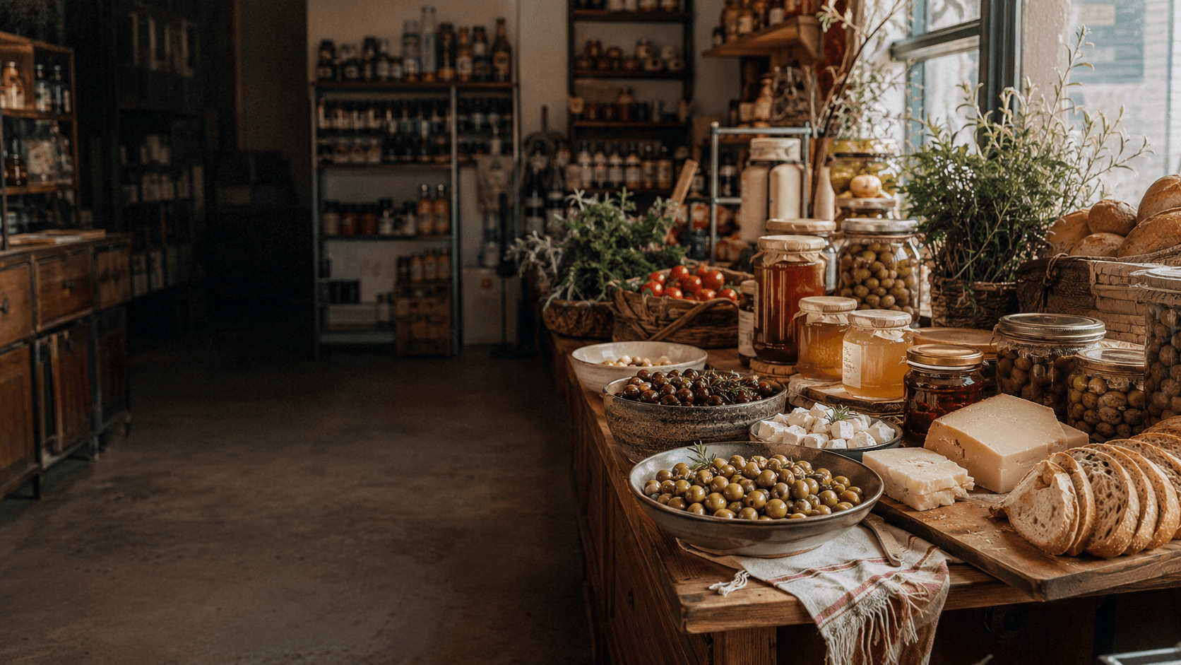
A responsive redesign for Tereci's website, rebuilt around the products instead of around the logo. The goal was a site that feels like walking into one of the stores: warm, organized, focused on what's actually for sale.
Tereci is a family-run grocer with five stores in İzmir, selling olives, honey, cheese, and the kind of Turkish breakfast staples people drive across town to find. Their existing site had grown over the years and turned into something the brand had outgrown: oversized headers eating half the screen, brand red competing with itself in every corner, icons fighting product photos for attention. The catalog deserved a calmer stage.
/Approach/
I rebuilt the layout around the products and let the brand identity support them rather than crowd them. Red moved out of the background and into the places it actually does work: navigation, calls to action, accents. Category icons simplified down to recognizable shapes, typography became readable at every size, and product photos finally got the breathing room they need to look like food instead of inventory. The breakfast spread does the talking.


/What Changed/
The new design moves closer to what Tereci already is in person: a place that's proud of its catalog and wants you to see it clearly. Hierarchy is calmer, the red feels intentional, and the site reads at a glance instead of asking visitors to decode it. The build is in development now and not yet live, but the design is set.
Web Design
/More projects.
Project name
Description
4.9 / 5
We’ve helped 95+ businesses
hit their targets—yours could be next.
